Grove Collaborative
Role
Product Design
Overview
Designed experiences to help customers find the best natural and sustainable goods. Led the design team's transition to Figma and contributed to other internal strategic initiatives.
Enhanced Product Reviews
Problem
We know that social proof is a huge factor when it comes to purchasing decisions, so we wanted to find ways of enhancing the review content to help customers get more information before they buy.
The Work
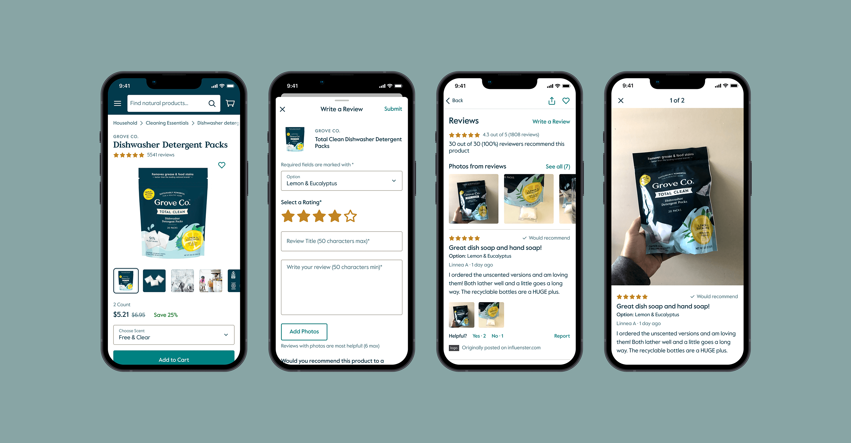
We had initially planned to start with adding images to reviews to allow customers to show off their products — we know that before and after photos are especially impactful for our cleaning supplies, so this would be a big help to allow potential customers to see how well our products work. I designed this experience from scratch, but the project was put on hold as our leadership decided to use a 3rd party tool for our new reviews updates, mostly because it allowed us to syndicate reviews across the sites of our retail partners.
Luckily my initial design work didn’t go to waste, because our mobile app implementation would need to be built from scratch. I tweaked my initial images-in-reviews work a bit to make sure the data and flow was compatible with our partner SDK, and created other designs to build on the additional features that we got with the 3rd party product. The web implementation came with an out-of-the-box UI, though it needed A LOT of custom work to bring it up to our look and feel — I actually ended up writing a lot of CSS to help get things up to par with our visual design expectations.
Luckily my initial design work didn’t go to waste, because our mobile app implementation would need to be built from scratch. I tweaked my initial images-in-reviews work a bit to make sure the data and flow was compatible with our partner SDK, and created other designs to build on the additional features that we got with the 3rd party product. The web implementation came with an out-of-the-box UI, though it needed A LOT of custom work to bring it up to our look and feel — I actually ended up writing a lot of CSS to help get things up to par with our visual design expectations.

Design System + Figma Transition
The Work
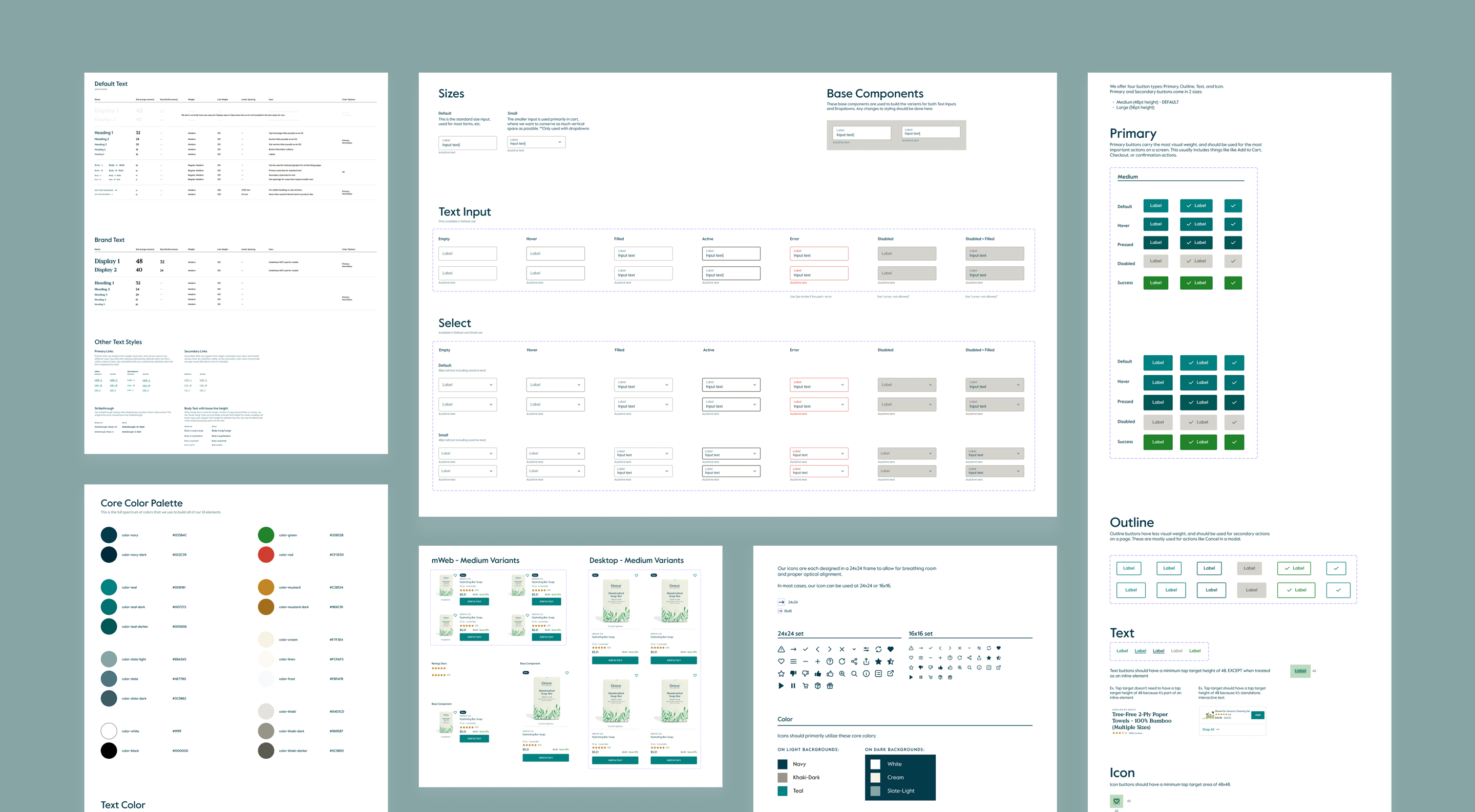
During my time at Grove, I led our team's transition from Sketch to Figma. This included developing new workflows, helping to educate the team about working in Figma, as well as rebuilding most of our design system from scratch. While we had an existing design system, Figma's feature set allowed us to build more rebust and flexible components that would make our lives easier — I LOVE efficiency, so I really enjoyed trying to find the best way to organize and stucture all the pieces. I also partnered with another designer, alongside some developers, to help translate this new work into code. This allowed the engineering team to also have a set of reusable components that matched our design system, unlocking a more efficient and accurate handoff process.

Loyalty Program
Problem
How can we build a more loyal following by rewarding customers for their purchases and engagement with Grove? In particular, how can we design a program that excites and realizes value for early lifecycle customers?
The Work
I was involved very early on in the discussions around this work. I partnered closely with PMs and other stakeholders to really understand the problem, brainstorm, and define strategy. I contributed to the pivotal PRFAQ document (my first exerience with such a doc — learn more here), which helps the team imagine what future outcomes of the project could (and should) be, as well as captures open questions to help move us forward.
We spent a good amount of time analyzing existing customer research, investigating best practices across the industry, as well as planning for new research that would help us answer more specific questions about customer behavior and expectations.
We spent a good amount of time analyzing existing customer research, investigating best practices across the industry, as well as planning for new research that would help us answer more specific questions about customer behavior and expectations.
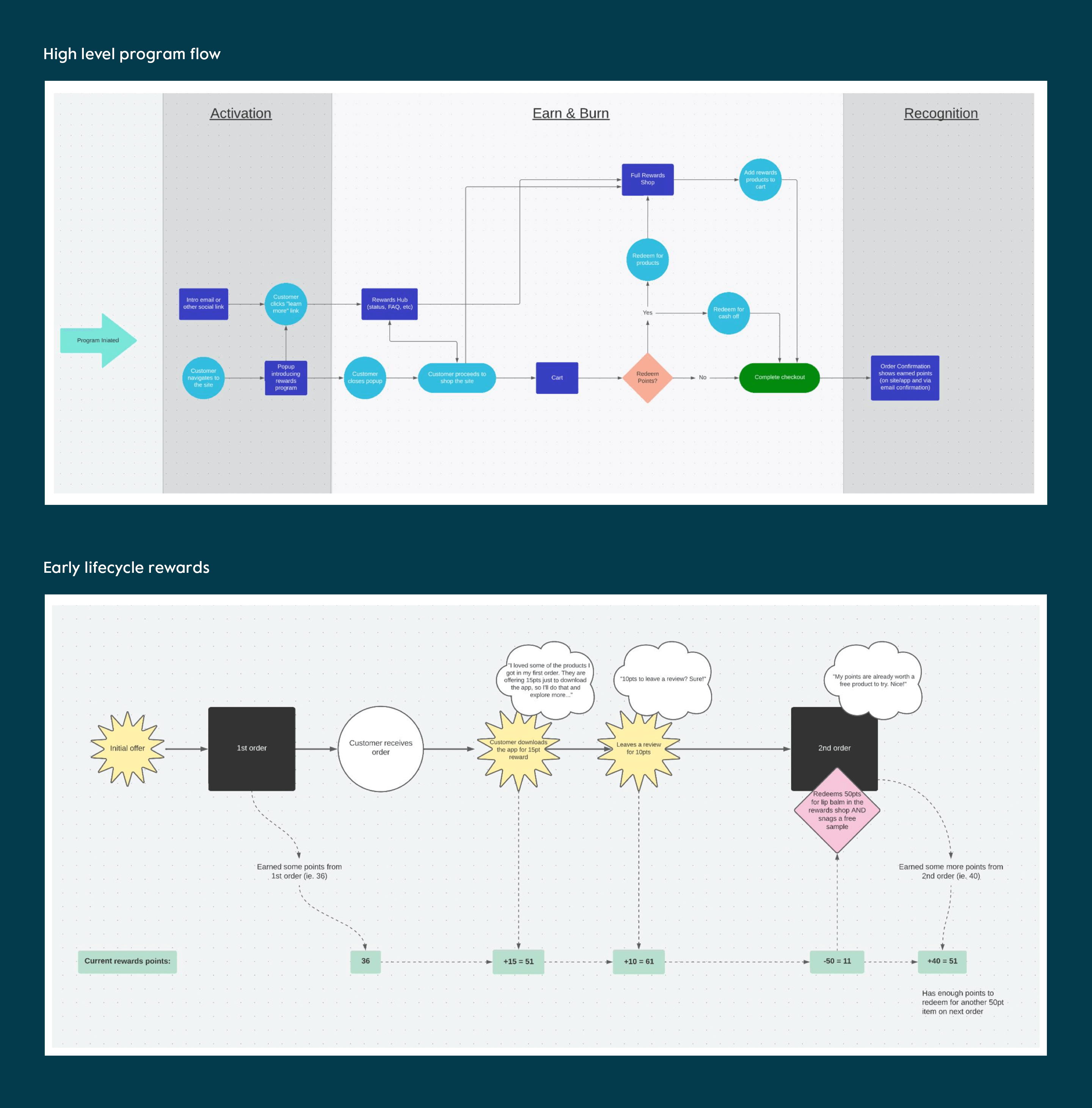
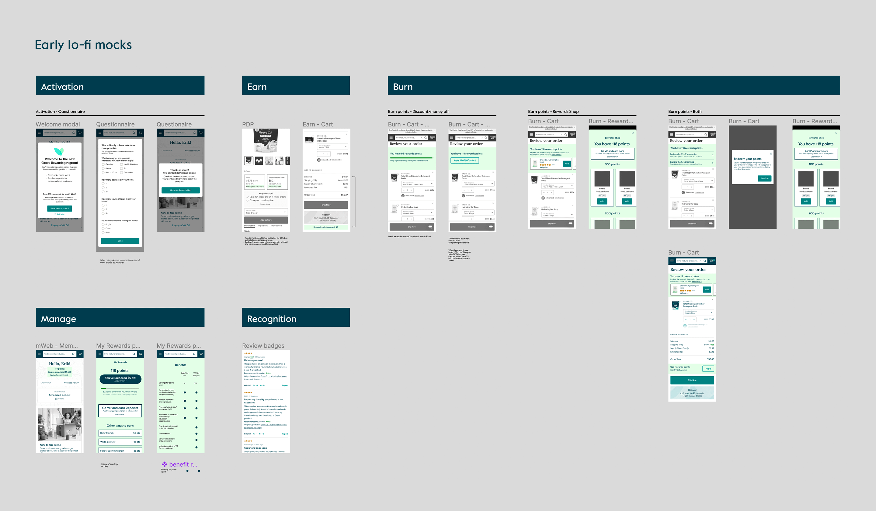
I also began to develop high level flows and mocks that helped facilitate discussion and project planning. One of the most interesting challenges we were exploring was how to allow early customers to realize value from the program (one of our key metrics was 90-day retention), so I mapped out this experience and how we might set a customer up with enough bonus points so that they could actually redeem them early on. During this time, our engineering team was also vetting some 3rd party products that we'd use as the backend foundation for the program, so these mocks helped them get a general idea of the direction we were going and the features we'd want to include.


We had made a lot of progress and were gaining momentum, but unfortunately, this is when layoffs hit, and where the project would end for us. While it would have been great to see this project all the way through, I learned a lot and am really proud of all the upfront work and strategtic thinking that was done.