Soundhound
Role
Lead Product Designer
Overview
Successfully initiated and led a redesign of the SoundHound mobile app—an app that still sees millions of monthly active users. Helped to define key focus areas and data-centered goals that led to increases in user activity and organic growth through content sharing. Also supported design work on the Hound voice assistant app by creating intuitive conversational workflows and by owning and promoting a cohesive design system.
Soundhound (the app)
The Problem
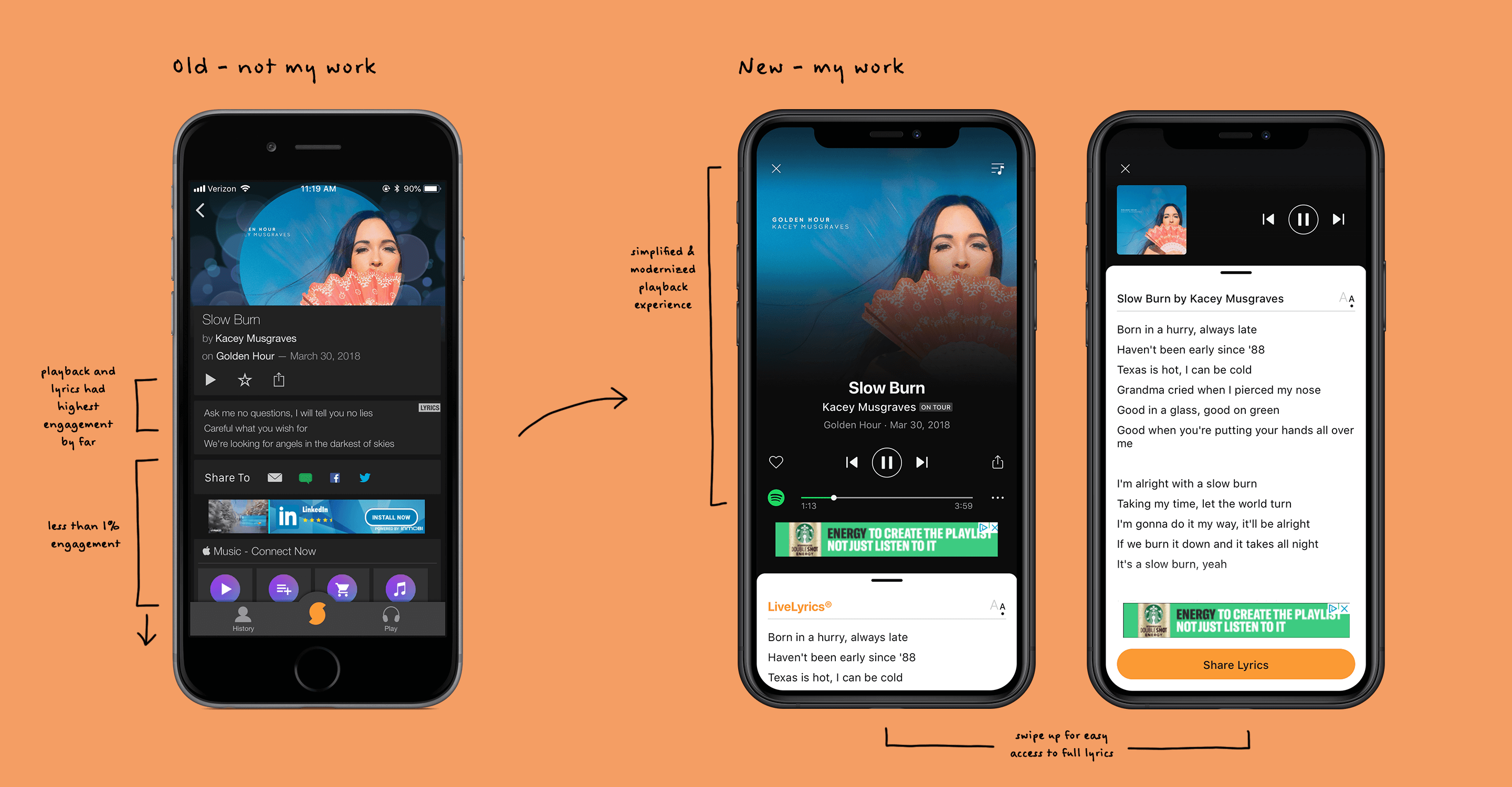
Soundhound was one of the OG top apps for smartphones, but as the way we listen to music shifts to streaming, there is less of a need for the utility of song detection. Though engagment and active users had been slowly declining for years, there were still millions of users that provided a decent chunk of ad revenue that the company wanted to hold on to. Besides that, there was very little direction or vision for the app, so the product team was tasked with finding ways to improve engagement with existing users, if not also adding new users.

Data-driven solutions
Given the ambiguous problem space, we decided to first dive into the data. I partnered with the PM to gather and analyze the numbers regarding how the app was currently being used. Turns out there were a TON of features that were basically not being used at all. On the other hand, there were two features that stood out as being most relevant to users: playback and lyrics. We validated these use cases by surveying users and running small focus groups. While playback was an obvious expectation for a music app, most users were more excited about the lyrics experience, specifically our LiveLyrics feature that provided a sing-along experience while listening to songs. We took these insights and formulated a strategy of modernizing the listening and playblack experience, while also making lyrics a more prominent and accessible piece of the app. I developed multiple prototypes of possible UI treatments, and tested them within the company to narrow down the direction. This lead to us moving forward with a swipeable panel that gave users that were interested in lyrics the ability to easily access a more complete view. We also started to test a feature that allowed users to share lyrics from their favorite songs in hopes of spurring some organic growth.
Historically speaking
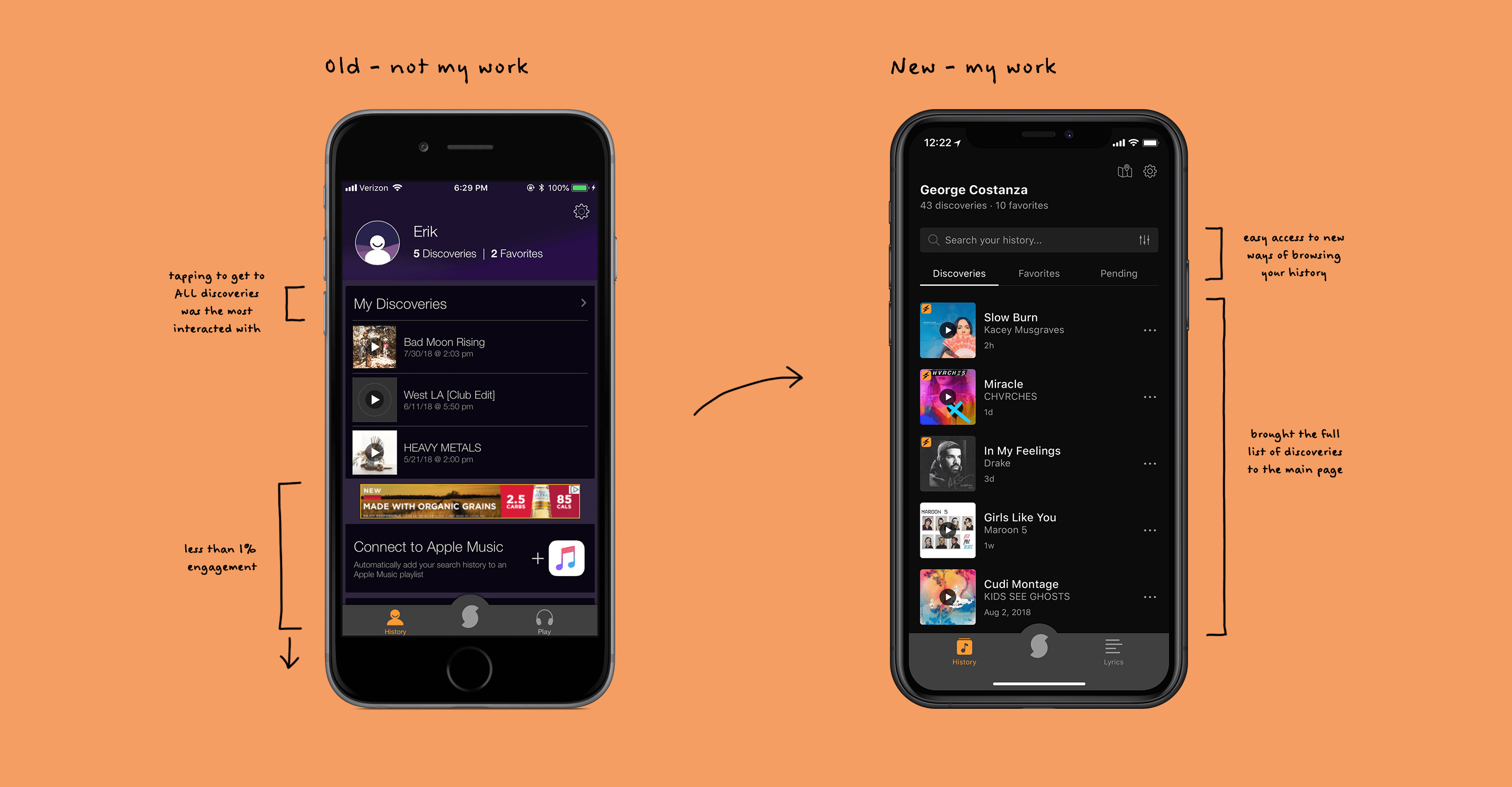
During our analysis of usage data, we also found that the history page had some major room for improvement. Again, most of the page was a vast wasteland of random content that didn't help a user easily access their previous discoveries. In fact, it only displayed 3 recent discoveries, while the rest were another tap away. By far, the most relevant action taken on this tab was to tap into the full history, so in my explorations, I focused on bringing the entire list to the main history landing page. I stripped away and/or reorganized the lesser-used portions of the UI, allowing the user to immediately get to their full history.

Results that went platinum
Upon launching these updates, we saw significant lift to engagement within the app. Engagement on the updated song page increased ~20%, and more specifically, engagement with lyrics increased ~50%. The new history page saw an increase of ~40% engagement, and overall, the amount of songs played per user increased by ~20%.